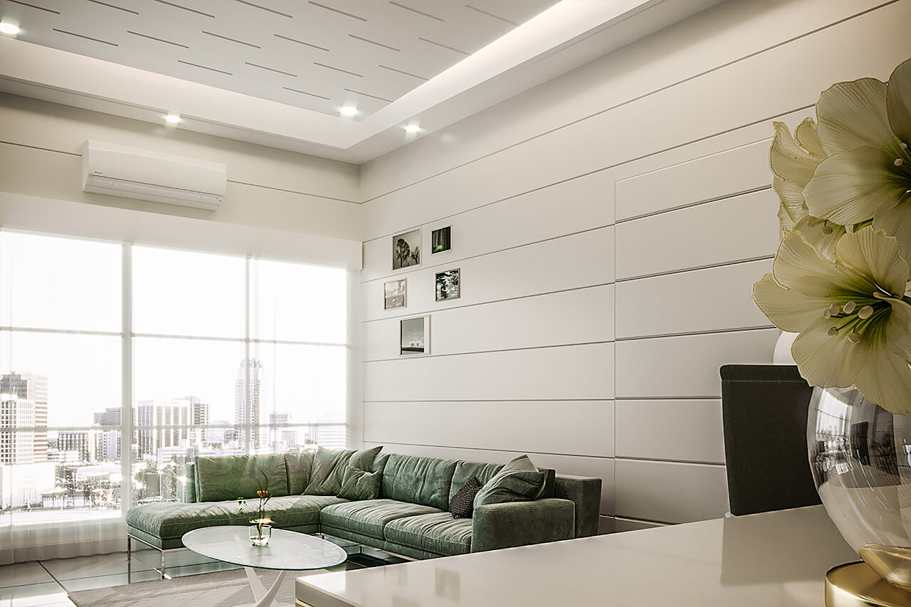
Our architects designed this white color interior for the speculative house – a property built to be sold – in the high-rise part of the Vancouver. The client, a fashion entrepreneur, purchased the property while it was under construction and asked for it to feel homey and classy, but not "too done".
In response, we chose to furnish the apartment with a diverse mix of light artwork and furniture designs that could have been moved freely in the apartment over time. Like our customer we adore French andItalian interior design, so we tried to achieve a mix of both.
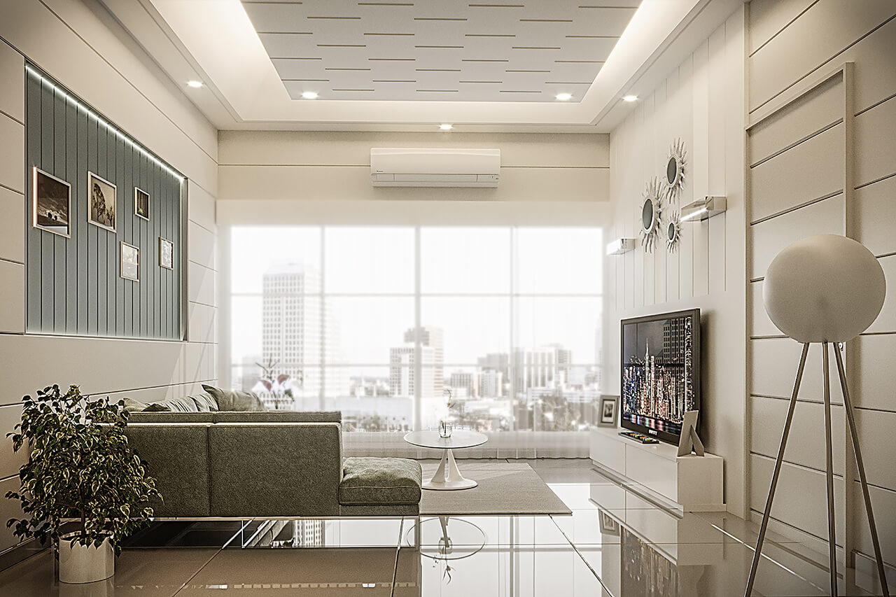
Our designers chose a variety of furniture for this white color interior project, including the white unique table, a floor lamp beside the furniture, one carpet, fabric furniture, and artworks. These and other contemporary accessories were then paired with vintage pieces. This work intentionally has contrasting features: dark and light, matt and glossy, solid and transparent. The shapes of accessories and furniture vary from organic to geometric.
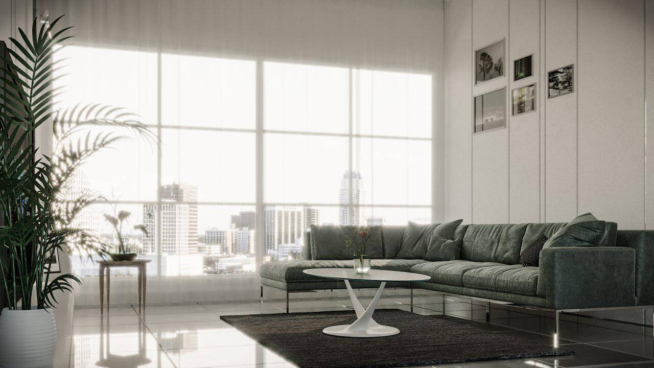
The amount of light your living room receives should act as a gauge for choosing the color of your carpet. If the room is well lit, you may go for darker shades. As u can see we chose a dark carpet for this living room in 3D modeling to balance the color temperature of the space.
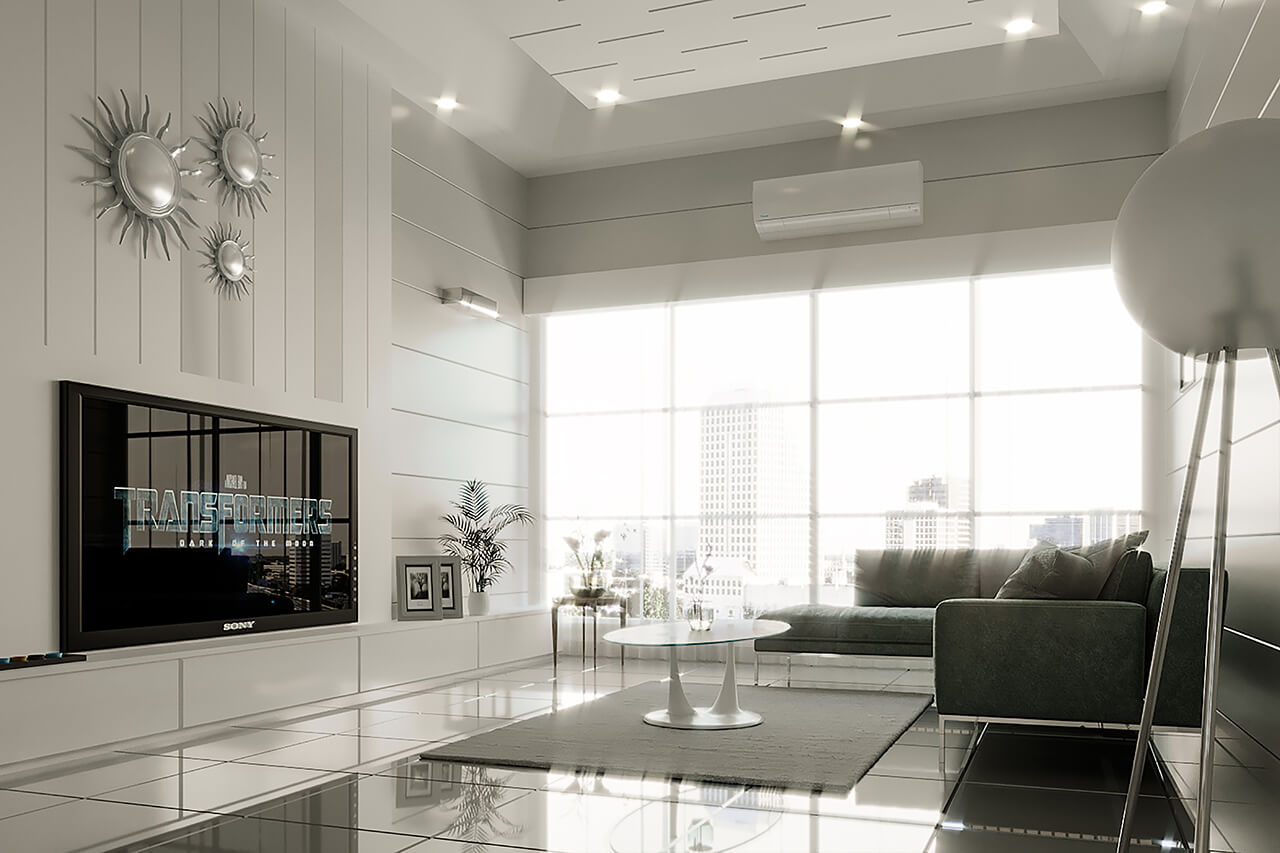
Unsurprisingly, most people prefer large windows rather than small ones. The reasons are diverse. Large windows are best when the views are also attractive and when there’s something pleasant to see. They also let in lots of natural light. this characteristic makes them finest for living rooms. They also create a sense of openness and brightness.
But they also have some challenges, decorating a living room that has large windows is not as easy as you might think. Since the windows are so large, they let in lots of sunlight and thus the room is already very bright. In this case, two options appear.
You can either continue on the same line and use bright colors to further make the décor even more bright and airy, or you can try to create contrasts by using darker colors. We tried to combine both approaches together and use bright colors in walls while using a dark color in furniture with an emphasis on the contrast in this artistic space to satisfy client needs.
In response, we chose to furnish the apartment with a diverse mix of light artwork and furniture designs that could have been moved freely in the apartment over time. Like our customer we adore French andItalian interior design, so we tried to achieve a mix of both.
Our designers chose a variety of furniture for this white color interior project, including the white unique table, a floor lamp beside the furniture, one carpet, fabric furniture, and artworks. These and other contemporary accessories were then paired with vintage pieces. This work intentionally has contrasting features: dark and light, matt and glossy, solid and transparent. The shapes of accessories and furniture vary from organic to geometric.
The amount of light your living room receives should act as a gauge for choosing the color of your carpet. If the room is well lit, you may go for darker shades. As u can see we chose a dark carpet for this living room in 3D modeling to balance the color temperature of the space.
Unsurprisingly, most people prefer large windows rather than small ones. The reasons are diverse. Large windows are best when the views are also attractive and when there’s something pleasant to see. They also let in lots of natural light. this characteristic makes them finest for living rooms. They also create a sense of openness and brightness.
But they also have some challenges, decorating a living room that has large windows is not as easy as you might think. Since the windows are so large, they let in lots of sunlight and thus the room is already very bright. In this case, two options appear.
You can either continue on the same line and use bright colors to further make the décor even more bright and airy, or you can try to create contrasts by using darker colors. We tried to combine both approaches together and use bright colors in walls while using a dark color in furniture with an emphasis on the contrast in this artistic space to satisfy client needs.
About The Project
- Architect: Jing Feng
- Rating: ★★★★☆
- Date: 2017
- Country: Canada
- Assistants: Isabel woodman, Alex Hudson, Erik Andersen
- Project Type: Residential
- SQ. FT: 1600
Comments